Overview
Understand the impact of typography on public spaces by identifying and analyzing poor typography choices.
Process
— Explore Environment:
I took a walk around the neighborhood, visited local shops, grocery stores, libraries, etc., and looked for examples of typography in signs, packaging, advertisements, and posters.
— Identify Bad Typography:
In identifying bad typography, I searched for typography that was hard to read, poorly spaced, mismatched in style, or otherwise unappealing. I also considered factors such as font choice, kerning, leading, alignment, and color contrast. Why was it bad? Did it match what the product is conveying? Did it have to match what they were conveying?
— Document and Analyze Your Findings:
As part of the process, I took photos of examples I thought included bad typography. In addition, I also prepared a brief analysis for each example, explaining why I considered the typography to be poor, discussing the potential impact of the bad typography on the viewer’s experience and the overall message being conveyed.
— Redesign Your Choice of Findings:
Finally, I redesigned my findings without changing the content in the original work. If it was a product, I was not allowed to change the logo. Everything must maintain, but the design (depending on the finding of my choice) was up to my decision.
Problem
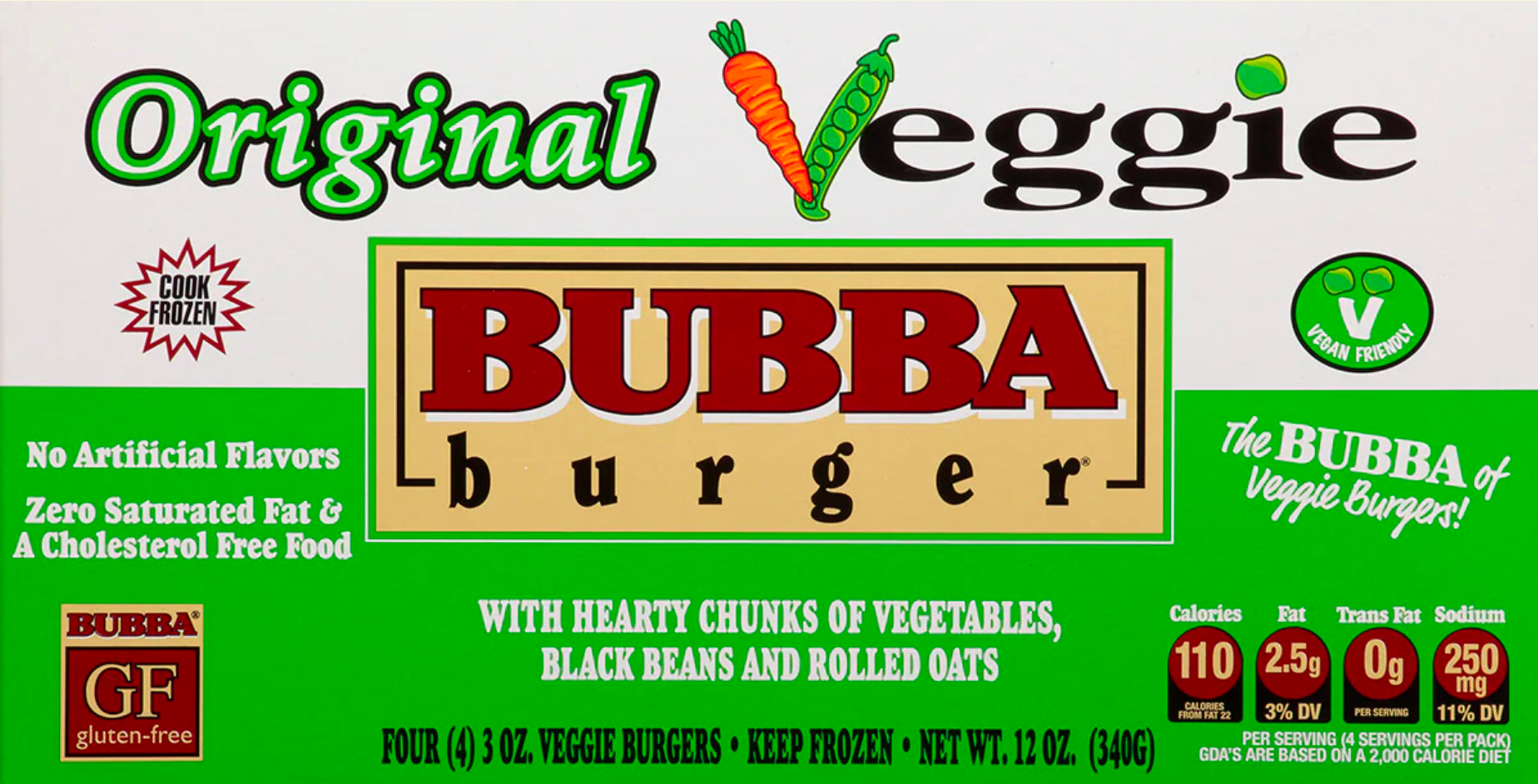
— Poor Visual Hierarchy:
The viewer's eyes are constantly roaming the surface of the product packaging because it is unclear on what the product wants to emphasize and/or spotlight. It is total and completely overwhelming to the buying customer as the information is organized arbitrarily, with the intent to simply fill the space of the space as opposed to telling the necessary information by limiting the use of white space, leading to an optically discomforting feeling of "crampness."
The viewer's eyes are constantly roaming the surface of the product packaging because it is unclear on what the product wants to emphasize and/or spotlight. It is total and completely overwhelming to the buying customer as the information is organized arbitrarily, with the intent to simply fill the space of the space as opposed to telling the necessary information by limiting the use of white space, leading to an optically discomforting feeling of "crampness."
Redesign
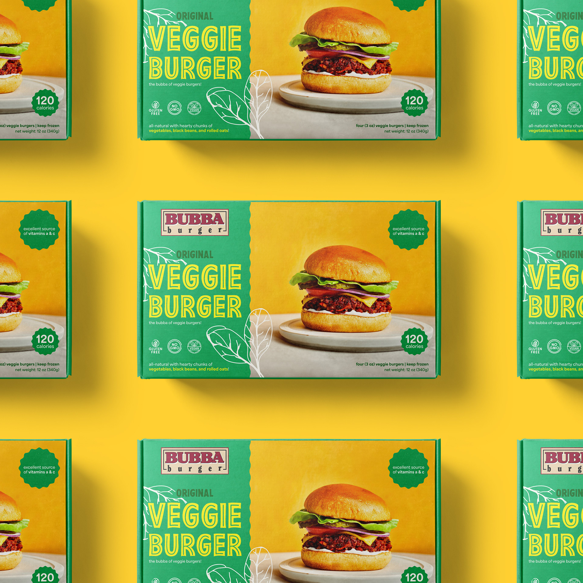
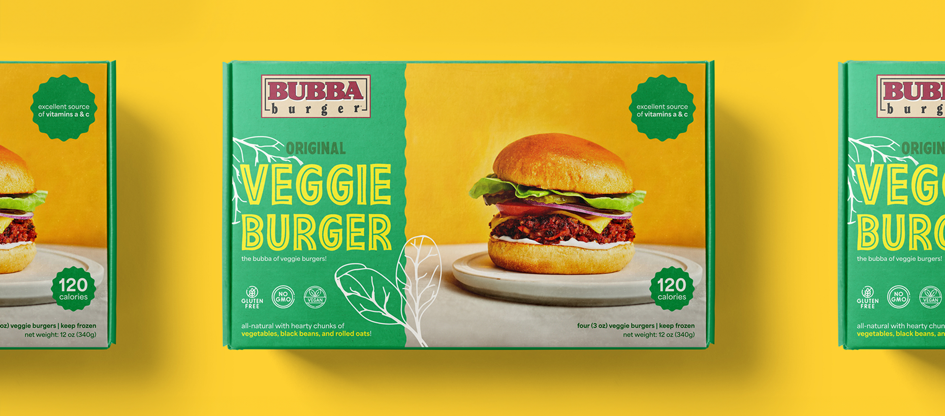
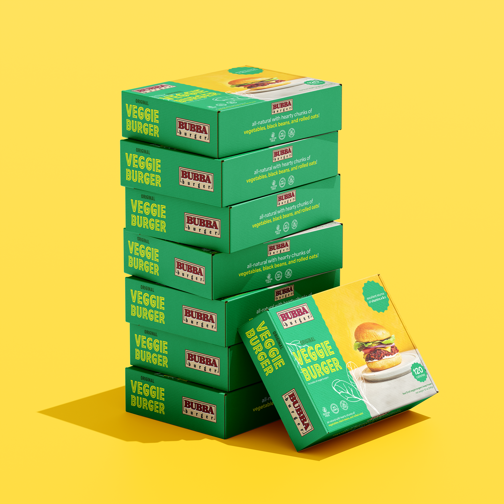
— Improved Visual Hierarchy:
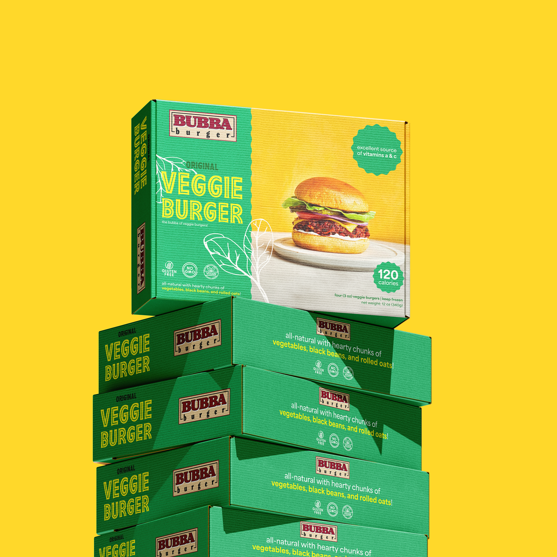
To improve on the visual hierarchy, important information are scaled larger, and/or emphasized through either color or shape elements for cohesion. As opposed to the previous design's decision to scatter facts across every perimeter of the packaging box, they are now organized from left to right to consider the buying customer's reading pattern.
To improve on the visual hierarchy, important information are scaled larger, and/or emphasized through either color or shape elements for cohesion. As opposed to the previous design's decision to scatter facts across every perimeter of the packaging box, they are now organized from left to right to consider the buying customer's reading pattern.
— Added Personality:
To make the information easier to retain, the packaging design had a design overhaul with new fonts, texture, color, and illustration. The new typeface PRESTO used in "ORIGINAL VEGGIE BURGER" reflects the organic ingredients used in the veggie burger meat with the in-line font resembling the stem and root of vegetable greens, and the heaviness of the font resembling the vegetable itself. The addition of illustrations create a friendlier image by adding energy and personality to the packaging, expanding upon Bubba Burger's demographic.
To make the information easier to retain, the packaging design had a design overhaul with new fonts, texture, color, and illustration. The new typeface PRESTO used in "ORIGINAL VEGGIE BURGER" reflects the organic ingredients used in the veggie burger meat with the in-line font resembling the stem and root of vegetable greens, and the heaviness of the font resembling the vegetable itself. The addition of illustrations create a friendlier image by adding energy and personality to the packaging, expanding upon Bubba Burger's demographic.