
Overview
Understand the impact of typography on public spaces by identifying and analyzing poor typography choices.
Process
— Explore Environment:
I took a walk around the neighborhood, visited local shops, grocery stores, libraries, etc., and looked for examples of typography in signs, packaging, advertisements, and posters.
— Identify Bad Typography:
In identifying bad typography, I searched for typography that was hard to read, poorly spaced, mismatched in style, or otherwise unappealing. I also considered factors such as font choice, kerning, leading, alignment, and color contrast. Why was it bad? Did it match what the product is conveying? Did it have to match what they were conveying?
— Document and Analyze Your Findings:
As part of the process, I took photos of examples I thought included bad typography. In addition, I also prepared a brief analysis for each example, explaining why I considered the typography to be poor, discussing the potential impact of the bad typography on the viewer’s experience and the overall message being conveyed.
— Redesign Your Choice of Findings:
Finally, I redesigned my findings without changing the content in the original work. If it was a product, I was not allowed to change the logo. Everything must maintain, but the design (depending on the finding of my choice) was up to my decision.
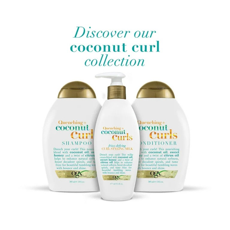
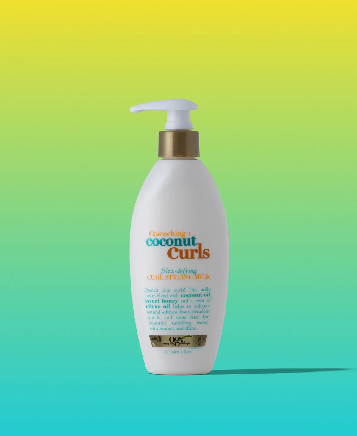
Problem
— Poor Typography:
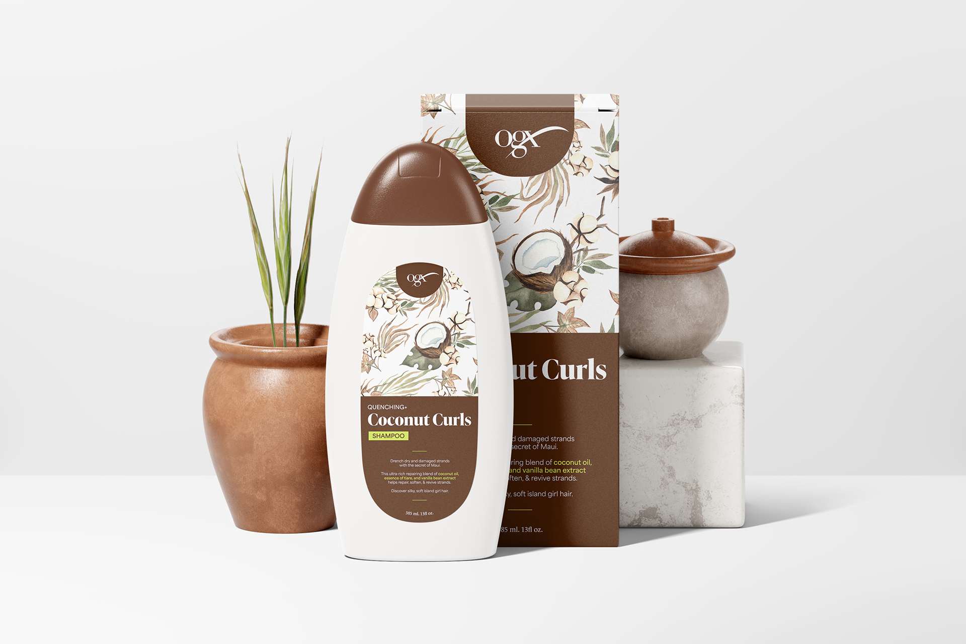
The justified text for the description of the shampoo creates an uncomfortable feeling for the consumer's eyes, affecting legibility as there is a lot of information to be told. There are keywords that the brand would like to highlight, such as "coconut milk" and "coconut oil," but the design emphasizes this through bolded text and a bigger point size, thus affecting the leading of the text to feel cramped.
The justified text for the description of the shampoo creates an uncomfortable feeling for the consumer's eyes, affecting legibility as there is a lot of information to be told. There are keywords that the brand would like to highlight, such as "coconut milk" and "coconut oil," but the design emphasizes this through bolded text and a bigger point size, thus affecting the leading of the text to feel cramped.
— Monotonous Design:
The overall design does not stand out from the line of other hair products on the shelves due to its weak typography-based design. There is a lack of contrast with their outdated choice of colors, leading to an unexciting product.
The overall design does not stand out from the line of other hair products on the shelves due to its weak typography-based design. There is a lack of contrast with their outdated choice of colors, leading to an unexciting product.
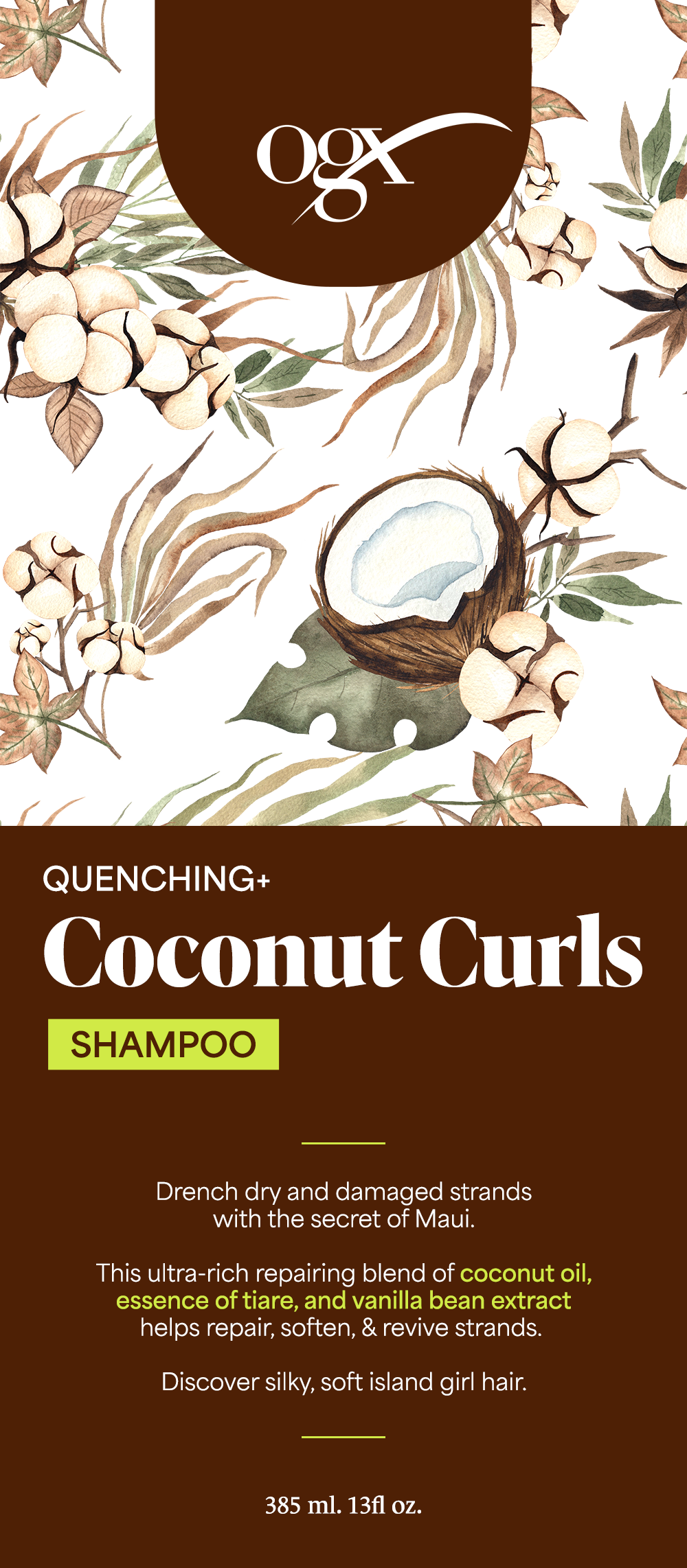
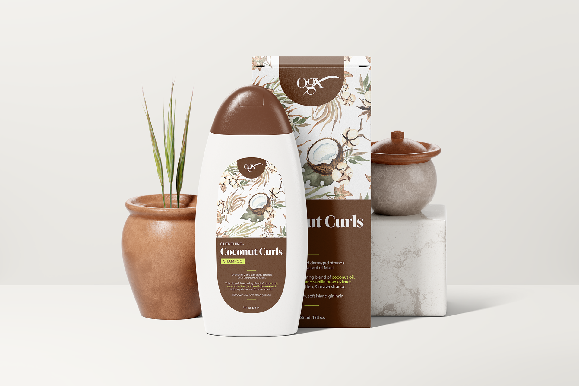
Redesign
— Consistent Typography:
To improve on the typography, the product description was broken up into three parts for better readability. Key ingredients are highlighted with the new brand colors, as well as set to a bolder weight to apply contrast against the lighter weight of the body text.
To improve on the typography, the product description was broken up into three parts for better readability. Key ingredients are highlighted with the new brand colors, as well as set to a bolder weight to apply contrast against the lighter weight of the body text.
— Engaging Design:
To entice consumers to pick up the product, the new design implements brand colors that relate to the product. The brown represents the nourishing coconut oils within the product, while the neon green reflects the natural tropics that curly hair is often associated with. The pattern and illustration adds variety to the overall type heavy design, which allows the consumers to assume what the product contains through a simple scan of the eye.
To entice consumers to pick up the product, the new design implements brand colors that relate to the product. The brown represents the nourishing coconut oils within the product, while the neon green reflects the natural tropics that curly hair is often associated with. The pattern and illustration adds variety to the overall type heavy design, which allows the consumers to assume what the product contains through a simple scan of the eye.